This is from The Tomkins (Mostly) Daily, the email newsletter I’m producing to share snippets of content from the site, and also some random thoughts.
In this case I thought it was worth adding to the main TTT site, as a fairly simple article on the progression of the Reds (bar the blip of 2020/21).
–> Sign up for the newsletter here.
Liverpool Now Absolutely Control xG – Best-Ever Figures
I’ve been a bit confused by Liverpool this season (from otherworldly to mediocre, especially at times at the back), but some key underlying numbers suggest this could be the Reds’ best vintage yet.
The slightly more chaotic football (and less protective midfield) can feel unnerving, but the data suggests that this is one hell of a team.
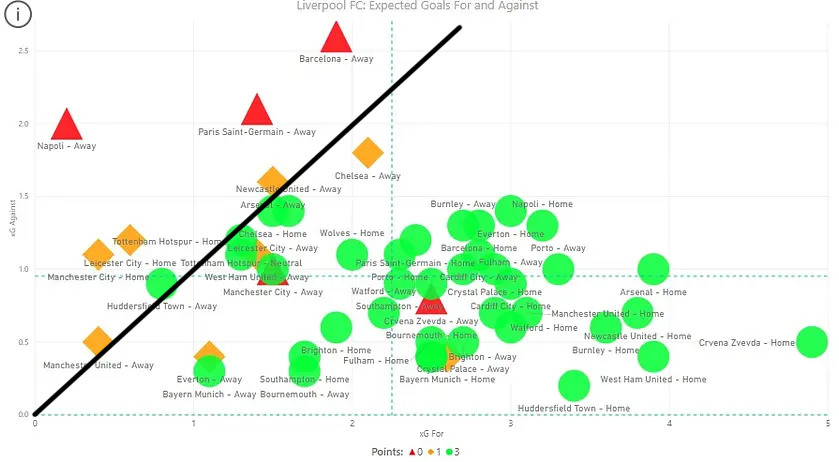
For a few years Andrew Beasley has been tracking the Reds’ xG for and against in a simple but highly effective graph on The Tomkins Times. While he’s refined the appearance over time (adding different background colours, etc), and the axes have different scales relating to the data of that season, the basics remain the same:
• Top left is bad, bottom right is good.
• Green is a win, amber a draw, red a defeat.
Here’s this season’s chart:
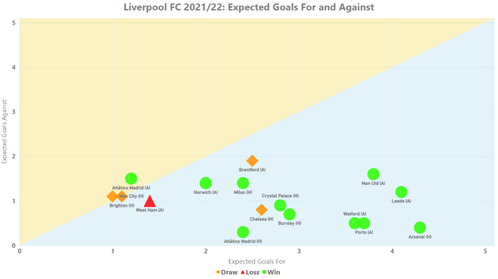
Ideally you want to be on the lower right side of the graph in circles of green; as low and as right as possible. While you may want a win against the balance of play (the xG), the performances ideally need to be that right side.
What’s perhaps shocking is the names of the clubs who have been pummelled on xG this season: Arsenal, Man United, Leeds and Porto. (That said, Arsenal at home appears to be a banker for that part of the chart.)
And the worst the Reds have been so far in 2021/22 is basically “on the line”, in a small number of games where the xG has been more-or-less a draw. Even at West Ham, the Reds just shaded the xG, but the Hammers won with set-pieces.
In previous seasons – even in the all-conquering teams of 2018-19 (97 points and the Champions of Europe) and 2019-20 (all kinds of records, and title-winners with 99 points) – there have been some big bad performances that show up high-left.
(Of course, we’re still not at the halfway stage in 2021/22, but getting closer.)
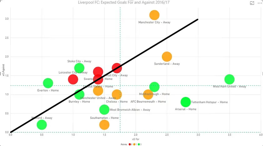
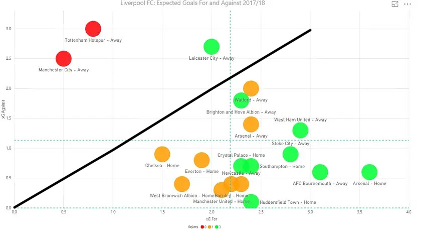
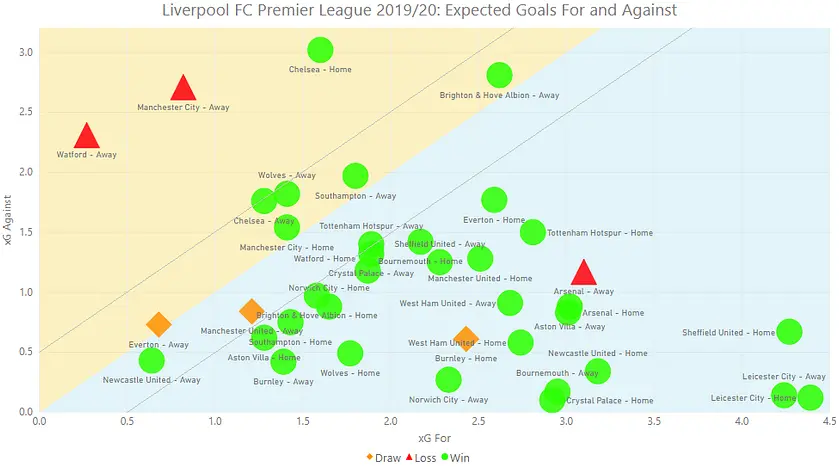
Here are a sample of graphs, albeit the first two cover half-seasons.
2016/17
2017/18
2018/19
2019/20
2020/21
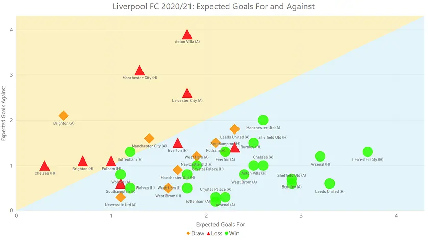
You can draw or lose, but if the xG puts the performance on the right the chart, it suggests it may have been bad finishing on the day. The aim, for consistency, surely has to be to get as many performances in the bottom right corner; or at least away from the dividing line that signifies a “draw” on xG.
In more recent iterations, Andrew, above the blue, has given us a yellowy sea of despair, where we don’t want to see any appearances.
If you play badly and don’t win on the xG, you have to try and find a way to get out with the points.
Again, let’s go back to this season, to see the sharp contrast:
Chelsea should have been despatched (especially with 10 men), and Brentford was frustrating, but the Reds have won all the other games where they were sufficiently superior on xG. Meanwhile, the win in Madrid is the only clear example of a game falling into the yellow area, and even that is fractional.
The chaotic graphs of the past have given way to something far more impressive – although most titles and European Cups still require an ugly win or two along the way.
To do this well with more injuries (overall) than last season and a midfield injury crisis is incredibly impressive, but there’s plenty of work still to be done.
For the rest of Andrew’s latest analysis, the article is for TTT subscribers here.