This is the part of the TTT Research Lab where our Transfer Price Index (TPI) work, initially created in 2010, will appear for reference purposes, with regularly updated interactive visuals. This is to specifically provide the latest data, © Graeme Riley and Paul Tomkins.
Historical TPI pieces can be found in other areas of TTT, such as the Archives and in the Transfers section of the Research Lab.
An introduction to The Transfer Price Index, written several years ago upon its creation, can be found here. It explains the basic concepts of our take on “football inflation”, and how it is calculated.
We will continue to add to, and update, the Transfer Price Index page.
Data Visualisations
Below are a number of Tableau visualisations created by official Tableau ‘Zen Master’ Robert Radburn for TTT, using our TPI data. These are interactive, so clicking on the graphs or their dropdown menus should offer different display options, such as focusing on one particular team.
Top 100 Transfers in Current Money
This popular subject has its own page.
Number of Transfers
Below is a visualisation of the number of Premier League transfers (purchases) each season, separated into each age category.
It shows that the number of transfers has increased since the ‘90s, due to larger squads; and that 2015/16 was interesting due to the smooth distribution across the age groups.
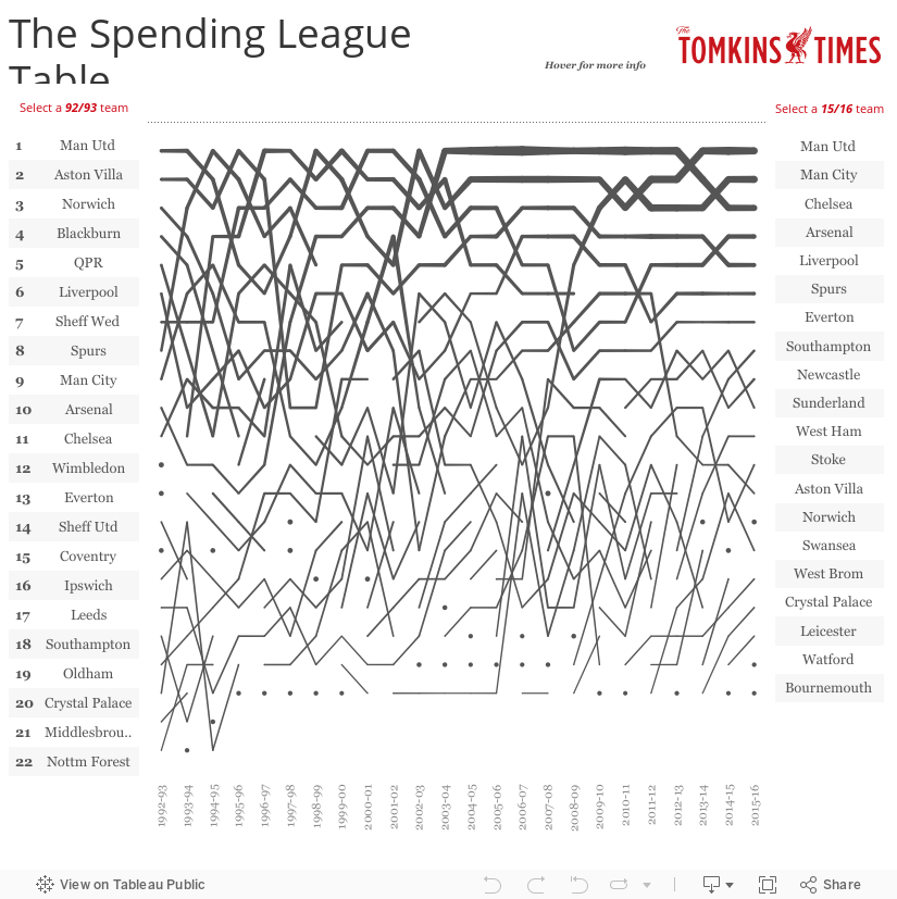
The £XI Rankings (average cost of all XIs once adjusted to current prices)
The visualisation below shows the teams listed by £XI rank each season. The £XI is the average cost of the starting XI all league games that season, adjusted for inflation; all figures being in current day prices. The graphic shows the teams by rank, with the line thickness representing the cost.
The £XI rank usually correlates closely to finishing position, although there are always outliers (none more so than Leicester in 2015/16).
£XI also tends to match wage bill analysis, with the advantage of £XI in that club accounts tend to be published a year after the season in question.
A drawback with £XI is that teams with lots of homegrown players (such as Liverpool and Manchester United in the 1990s and early 2000s) can skew the picture, but it’s increasingly rare for a big club to have more than a couple of homegrown players as regular starters. No model is perfect, but £XI is a handy gauge, particularly as a season unfolds, as unlike wage-bills, it can reflect the talent that does (or doesn’t) make it onto the pitch.
Click on a club (or numerous clubs) to compare and contrast, and to filter out the noise of all the other lines. The thicker the line, the more expensive the side.
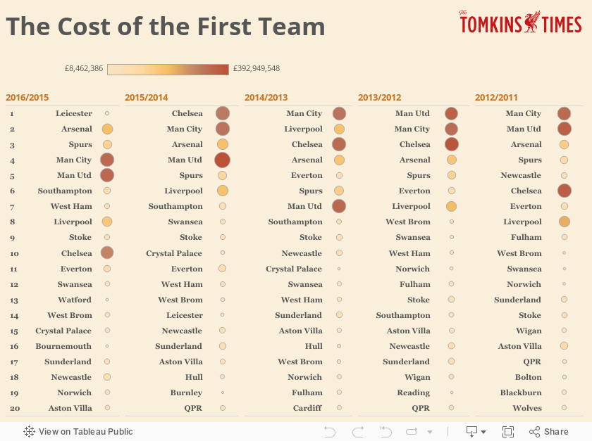
The Cost of the First Team
Below is a graphic that shows the relative costs of the first teams over the past five seasons. As ever, this is calculated by finding the average price of the XI over all 38 games, with inflation applied – to give what we can the £XI.