By Dan Kennett.
The “Liverpool Performance Dashboard” is now live for the 2014/15 season.
I had wanted to publish after 6 games but some of the new development was trickier than expected. This version is exclusive to TTT.
There are 2 major new features this season
- the addition of Champions League games
- the ability to use checkbox filters to control the data that you see and create your own charts.
The filters currently available are:
- Competition (Premier League, Champions League or All)
- Venue (Home, Away or All)
- Match (select the combination of matches you want to see or All Matches)
There are a number of new and enhanced charts
- Shot Ratios (TSR and SOTR)
- PDO
- Final 3rd Passing has volume and completion on a dual axis
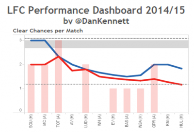
- Defensive Errors and Clear Cut Chances have the individual match totals as well as the running average
- all benchmarks (the horizontal bands and lines in each chart) have been updated to include last season Premier League data
Please use the comments section to let me know:
- Any defects or typos that you find
- Ideas for new features/filters
- General feedback on how to further improve the dashboard
This first publication of the dashboard makes pretty depressing viewing for us Liverpool fans. You can see just how badly we’re doing compared to last season and top 4 benchmarks.
- Save% is bad, opponents Save% is fantastic
- Penalty Box Conversion is awful, our opponents are looking like a Premier League champion team.
- Clear Cut Chances are probably the worst of the lot, we’re also allowing our opponents 50% more CCC that we did last season
- Our Final 3rd passing is mediocre
- Our Defensive Errors are slightly up on last season
The only glimmer of hope is that our TSR (Total Shots Ratio) is good and strongly indicative of a top 4 performance. Hopefully we can continue to control the volume of total shots in the games we play and if we combine this with taking a few % more of our chances and cut out a few defensive howlers, we could yet be in a very nice position.
