By Paul Tomkins.
I recently worked out the cost of Liverpool’s squad and its likely strongest XI for TTT, and to me it looked like the Reds were closing the gap – albeit slightly – on the financial powerhouses. Now I’ve calculated the current values of last season’s top six (the six richest clubs), as things stand in mid-August, and I’m not too sure – although all clubs had key players absent.
I thought I’d look at how the top six compared on the opening weekend of the season, and what the major changes have been since last season. As ever, there are a few surprises, in amongst the sea of predictability.
For anyone who hasn’t seen it, last week I wrote what I hoped would be a summation of many (if not all) of the key findings from the Transfer Price Index work undertaken with Graeme Riley since 2010, which appeared on VICE Sports. I thought it was worth drawing your attention to, as it perhaps explains the work we do more clearly than anything else I’ve written.
The piece highlights the difference between standard UK inflation since 1992, during which time the cost of a basket of shopping has doubled; in the same period, the average price of a Premier League footballer increased elevenfold. So since 1992 football inflation has run at roughly 5.5 times the UK’s Retail Price Index, albeit with much of that inflation coming in the past couple of years, and periods of deflation during economic downturns. The reason for the sharp acceleration in prices in the past couple of years? – the massive hike in TV revenue.
Squads
Obviously the transfer window hasn’t closed yet, so squad costs aren’t conclusive at this stage.
Even so, has Liverpool’s spending closed the gap on the four “richer” clubs; and in particular, Arsenal, who were the nearest ranked, and themselves adrift of the Rich Three?
But before going onto that (which will be for subscribers only), I wanted to quickly address the issue of the predictability of the TPI ‘£XI’ model (which is obviously different to wage bill analysis, but produces similar findings).
Before the Stoke game I noted on Twitter (I know, I know) that individual games aren’t always won by the richest clubs with the best teams; that individual games rely on a host of random factors, as well as the skill involved. Someone then took this to discredit the TPI work – as if one game is the same as the law of averages that build up over a 38-game season, and which grow stronger over even greater sample sizes.
For the past 11 seasons, one of the Rich Three of United, City and Chelsea has won the league, with their XI costing, on average, at least £236m (we call this the £XI: the XIs across all 38 league games, adjusted for inflation). And yet in those 11 seasons, each of those teams has lost games that, on paper, they should not have lost. Chelsea lost to Newcastle, Spurs and West Brom last season. But overall, Chelsea also won 26 games, and were therefore champions. Equally, Liverpool will not always beat Stoke; far from it. However, they pretty much always finish above them in the table. Ergo, these are two very different things.
More often than not the richer clubs, if well managed, will beat the poorer clubs; but amidst this predictability is the randomness of chances taken and missed, freakish own goals, uncharacteristic mistakes, costly refereeing blunders, fitness issues (including travel after European games), and umpteen other factors, including just having a plain old bad day at the office.
TPI predicted last season’s top six, but not the exact order. It suggested that Spurs should be 6th and Liverpool 5th, and on the last day the Reds royally cocked that up. Therefore, in the end, Liverpool, rather than hit the par I so often spoke about, underachieved.
However, over longer periods of time – over the past 10 years, and also going back to the start of the Premier League era – the model predicts the top ten in the precise order. The greater the sample, the more accurate it becomes.
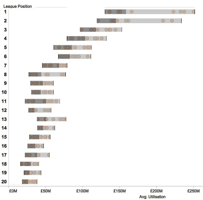
If you look at the two box-plots below (created by Robert Radburn, who supports one of Liverpool’s rivals), you can see the evidence for this. The first one is ‘busier’, as it contains all the information; the second one is stripped down to show the average trends.
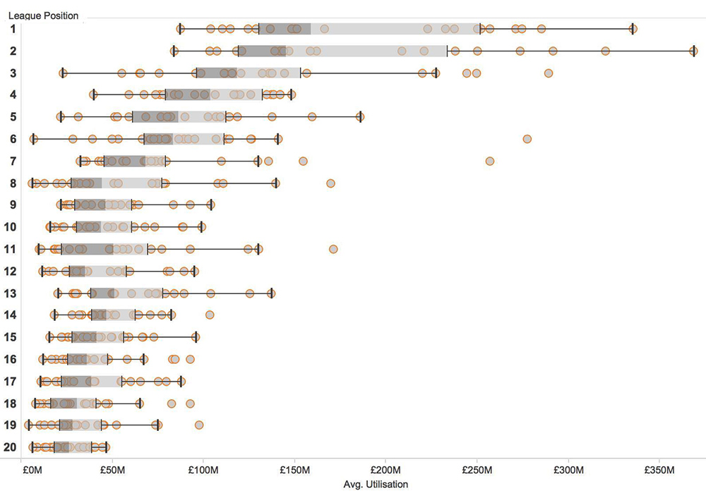
In the first graphic, each circle represents one team’s £XI for the season – how much it cost on the Y axis, and where it finished on the X axis. You can see a number of outliers, where costly teams finished 6th (Chelsea 2011/12), 7th (Man United under Moyes), 8th and 11th. The grey bar, however, represent the averages.
If you focus on just the averages, then you can see a steady stepping from 1st down to 10th. So we can’t say that the most expensive £XI always wins the league – although that happens 40% of the time (and it will be in the top four 80% of the time; with the two most recent times that it wasn’t involving the extenuating circumstances of Chelsea winning the Champions League in 2012 – so lots of extra high-pressure games – and Man United’s failed experiment with David Moyes, albeit after the seismic event of Alex Ferguson retiring).
But we can say that over a 10– or 25-year period, the teams that average the highest league position will also be the costliest £XIs. And ditto with the 2nd-ranked finishing 2nd, and the 3rd-ranked finishing 3rd.
Anyway, now onto this season’s data, and also, the introduction of two new measures in addition to £XI.
The rest of this post is for subscribers only.
[ttt-subscribe-article]